Waze Analysis & Visualization
I spent Summer 2018 interning at Louisville Metro Government’s Office of Civic Innovation, which specializes in using technology to help the city deliver services. I worked on a data analysis and visualization project, using data from the popular navigation app Waze as a proxy for traffic counts. One such use case was for the city to measure in changes in congestion levels before and after completing lane adjustment and signal retiming projects, without having to hire expensive engineering firms to manually count cars. I also spent time improving a pre-existing, barebones dashboard for visualizing millions of rows of data, allowing city planners and officials to more effectively drill down into the data and find out when and where traffic jams are occurring.
I completed the data analysis portion using an R script I wrote, which utilized dplyr, ggplot2, and lubridate. I used SQL to interface with the database in which the live data was stored, and I developed the dashboard in Microsoft Power BI, an enterprise business intelligence tool that Louisville Metro Government uses across all its departments. Throughout the summer, I consulted several times with Power BI experts in the Office of Performance Improvement and Innovation (of which the Office of Civic Innovation is a part) as well as traffic engineers in the Traffic Department.
Below, I’ve provided screenshots of the updated visualization template. You can read about more my summer on Medium, where I also share my thoughts on the future of data governance.
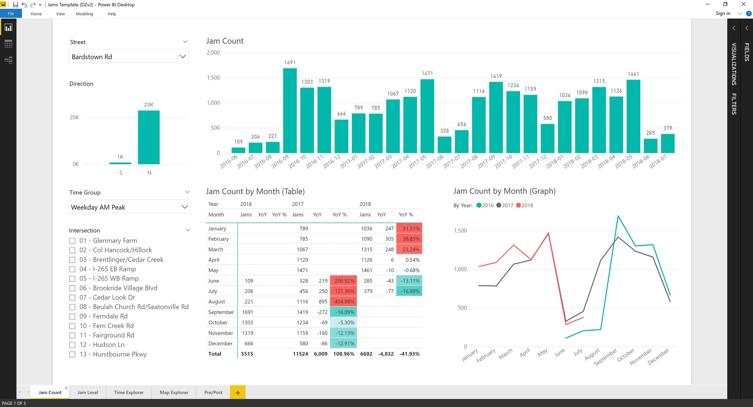
The homepage: the main area contains different ways of visualizing jam counts for the months contained in the data (bottom center), together with the year-over-year change and the year-over-year percentage change. This is shown in a year-over-year line graph for comparing how traffic counts change compared to the year before (bottom right), and a bar graph over the entire time period for showing the long-term trend (top). The left-hand column contains a series of filter for direction of travel, street intersection, and time period of day, which filters the rest of the page accordingly (here, we’re only filtering for Weekday AM Peak). Some of the features on this page existed previously, but I’ve added the graph and table that shows year-over-year traffic counts, together with revamping the layout.
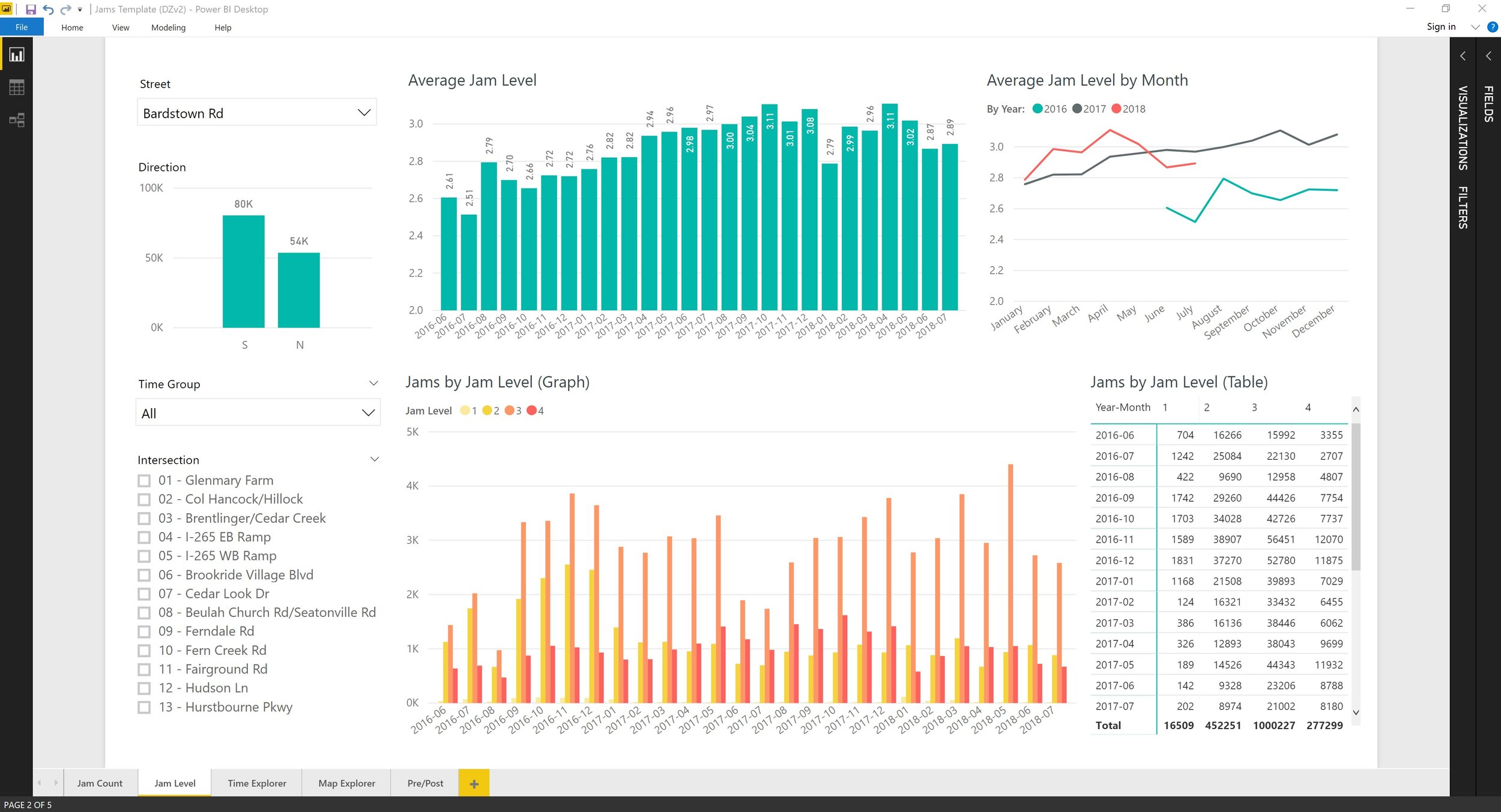
Jam levels page: Waze automatically classifies jams with a severity level, so this page breaks down the same jams from the previous page but by jam level. While this page again existed previously in a more limited form, I added the year-over-year graph on the top right in order to see how average jam level is changing compared to the year before and a table on the bottom right to easily extract data for a report. The left-hand column filters still work as before.
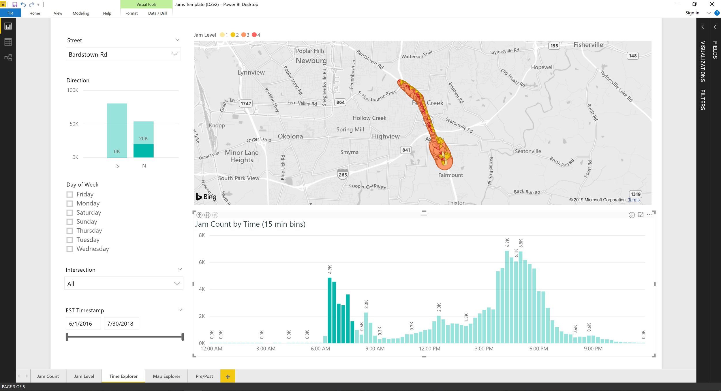
Time explorer page: The easiest way to describe this page is to illustrate it with an example, which is shown in the screenshot. Here, we’ve highlighted the bars in the histogram that correspond to 6:30 AM through 8:00 AM. Power BI automatically “cross-filters” those jams in the map, and since larger circles means more jams, we can see that during this period of the AM peak, most of the jams are happening in the southern segment of the Bardstown Road corridor (the street we’re currently focusing on). As traffic travels northbound (which we know from the mini bar graph in the top left that now shows 20K northbound jams and 0K southbound jams), cars reach the I-265 interchange and then get on the freeway, which leaves fewer jams occurring in the northern part of the corridor.
Another use case could be as follows: let’s say the Traffic Engineering department currently runs a coordinated signal timing plan from 6:30 AM to 8:30 AM for the AM peak (which essentially means that if you hit one green light, the subsequent lights will also be green by the time you reach them). If the time histogram were showing a backlog of jams from 6:00 AM to 6:30 AM, we would know that we should begin running the coordinated timing plan a half-hour earlier, starting at 6:00 AM.
You can also adjust the width of the histogram bins, starting as wide as 1-hour chunks of time (e.g. from 8 AM to 9 AM, from 9 AM to 10 AM, etc.) all the way down through 30 minute chunks, 15 minute chunks, 5 minute chunks, and a “continuous” chunk interval.
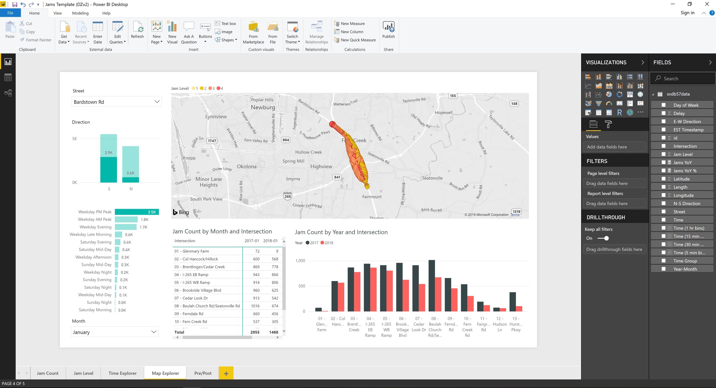
Map explorer page: A completely new page that allows the user to more minutely drown down into where jam reductions or jam increases are happening. Again, let’s illustrate with an example: let’s say we know that jams decreased during the PM Peak for the month of January 2018, but we want to see whether these changes were distributed evenly along the 3-mile corridor or whether these improvements were concentrated in a few areas. In the above screenshot, we’ve clicked on the “Weekday PM Peak” bar in the left-hand column, and selected January in the “Month” dropdown. This causes Power BI to show only PM Peak data for all January months on hand (at time of development, this was January 2017 and 2018). Turning to the bar graph, where black shows January 2017 and red shows January 2018, we see that the overall decreases indeed were not spread evenly across the thirteen traffic lights on Bardstown Road: intersections 6, 7, and 8 had the greatest drops in jam counts, even though the intersections also exhibited a modest decrease. Turning to Google Maps, we see that this of the road contains several schools, so we can conjecture that we were able to decrease a lot of the PM parent pickup traffic.
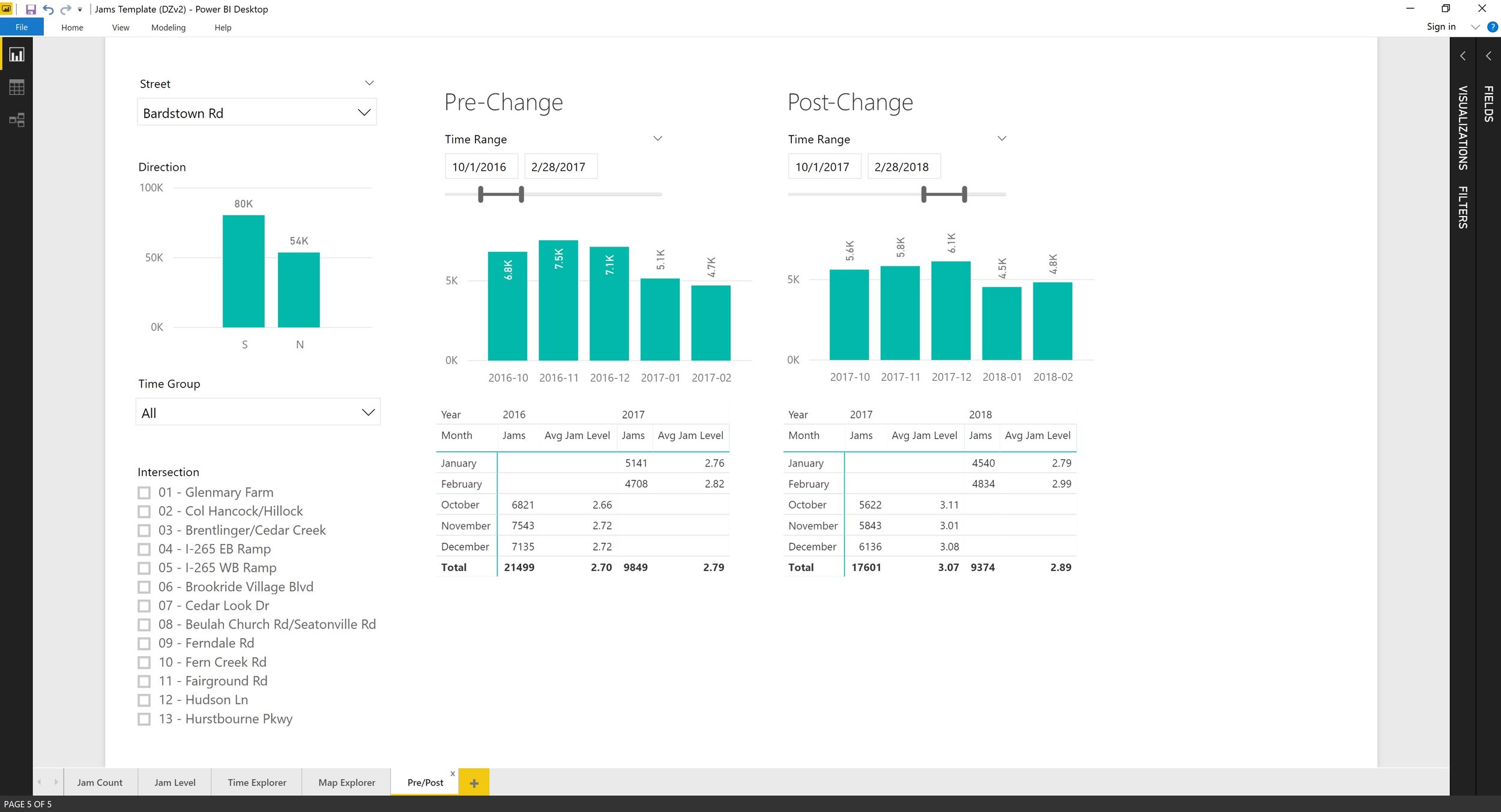
Pre/post comparison page: A completely new page that allows the user to perform a before/after comparison of traffic count during two distinct user-selected periods. The use case I had in mind was compiling data for a report or policy brief, particularly to show the impact of a project: if a traffic signal retiming was conducted along a route in November 2017, then the left side could display data for November 2016 to October 2017 and the right side could display data for November 2017 to October 2018, and the user would be able to quickly pull that data.